Color
User interfaces are made first-and-foremost to fulfill a user experience. This can be achieved with very basic elements, but is often dressed up with colors and textures. The use of design colors for digital UI work is tough to understand without practice. Using the right colors can help put the users in the frame of mind that compels them to take action. Color has the power to improve conversions by grabbing users’ attention and triggering the right emotions.
Color and Conversions
There has been a proven scientific connection between the color of products and the urge to purchase. Every time you see a color, there’s a chain of reactions taking place within the hypothalamus in your brain. Hormones are released to your thyroid, thus triggering emotions that affect your behavior. In fact, 62% to 90% of purchasing decisions is based on colors! So, digging deeper into the psychology of color can significantly improve elusive conversions for your website.
Where Should I Use Colors?
The colors that you use might not be outright apparent sometimes, but they do make a difference. The key areas that you must be careful about are:
- Pop-ups
- Borders
- Headlines
- Background hues
- Primary web banners or hero graphics
- Buttons, especially call for action
The 3 Best Colors for Call To Action Buttons:
 1. Red. The color red stands out on most web pages. It invokes passion, excitement, and urgency. If you want your customers to take urgent action on your product (i.e. purchase it, download an eBook etc.) then Red is the right color. Funny enough, many people make the statement that Red usually goes hand in hand with stop, but studies show it is one of the best colors to use for call to action buttons.
 2. Green. If the product or service you are selling relates to the environment, psychology, and peace, then green is the right call to action button color for you. Green is calming and can be associated with “Go” which is a motivator for many customers. It may be mentally easier for your clients to click on a green button rather than other colors.
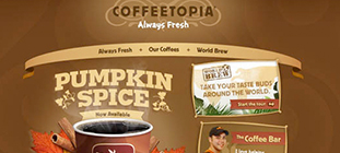
 3. Orange or Yellow. Orange is exciting and warm. Most individuals will associate it with warmth from the sun. This warmth in turn leads to people taking action. When customers feel happy they will be more likely to buy products that they associate with happiness. Let’s not forget that Amazon’s entire site is pasted with the color yellow and orange. It works for them, and they do TONS of website optimization testing, so there’s a lot of proof that it will work for your website too.
The 3 Worst Colors for Call To Action Buttons:
 1. Black. Black is dark and gloomy. It makes many people think you didn’t try hard enough and it has a tendency to blend into the background of most pages, making it the worst color to use as a call to action button.
 2. White. Even though it is technically the absence of all color, white is actually a horrible button color to use if you want your website visitors to take action. There a two reasons for this: First, white blends into the background, and second, white does not invoke emotions. These are two things you never want from your call to action button.
 3. Brown. Brown has no connotation of warmth or action. It doesn’t motivate your customers to click on your call to action button. It instead is perceived by many as boring and ugly.
10 Colors from the Internet Marketer’s Perception
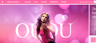 1. Pink: If your target market is made up mainly of women, then pink is a good color for you. The color is known to raise emotions of fun and romance. Pink is associated very strongly with youthful femininity. It is playful and brings to mind bubble gum and innocence. It is ideal for websites that hearken back to olden days or that target a particularly feminine audience.
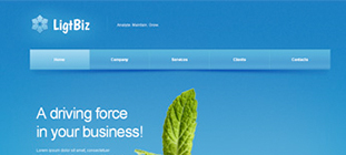 2. Blue: Blue signifies trustworthiness and provides an air of coolness. Any website that caters to online prescriptions, monetary transactions, or any other niche that demands reliability would be best served by this color.
 3. Red: Nothing holds people’s attention like red. It’s considered the most effective color for call to actions. If you’re designing that “act now” button, red is your color. Red is a stimulating, exciting color. It is associated with passion, power and sometimes anger. It can be used for warnings or to show danger, but it can also suggest strength, determination and boldness.
 4. Green: Green is the color of peace, tranquility, and nature. It can give users feelings of calm, rejuvenation, affluence and optimism. Darker shades are more linked to money, so sites that want to suggest affluence, growth and stability often use those shades. Lighter shades are more associated with spring and growth, so websites that want to reflect relaxation, freshness and honesty often use lighter shades. So if your website is about a great environmental cause or selling organic products, green should be the predominant background.
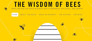 5. Yellow: In the marketing world, yellow is said to describe the healthy mind without worries or depressing thoughts. It’s best suited for online stores that sell products like kids’ apparel and toys. This color is also associated with caution. Yellow is often considered the most energizing color. From the earliest ages, people learn to associate yellow with the sun, so it becomes associated with warmth and happiness. Darker shades can suggest antiquity, suggesting yellowed parchment. Because of that, it can also be associated with wisdom and curiosity. It therefore is great for sites that want to demonstrate a sense of authority and intelligence.
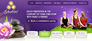 6. Purple: Purple oozes elegance and sophistication. This color is ideal for a website that features niche, luxury products.
 7. Orange: Orange can also signify sophistication, but at the same time be attention-grabbing. Orange is a more balanced and less overwhelming color than red. Vibrant, energetic, friendly and inviting, it is ideal for designs that need movement and energy. Websites that want to showcase their creativity often choose orange because it is unique and exciting, but it still has the comfort of a warm color. This color is suitable as a background for tech companies or websites that deal with gadgets.
 8. Gold: As a metallic color, gold signifies power and prestige. It works well with other colors that signify elegance, such as green and purple.
 9. Black: Black is versatile and goes well with any other color. It’s best used to bring about a contrast with the rest of the colors used in the website.
 10. Brown: Brown is a nondescript color that enthuses relaxation and calm. This color is perfect for websites that deal with health and wellness. Creams are calm, elegant and pure, making them a great background color for a website that wants to imply a sense of tradition. Tans are conservative and bring to mind piety. They can be dull, but they can also be reassuring, which makes them ideal for a site that doesn’t want to be too bold or outrageous. Dark brown feels wholesome and reliable, like a loaf of bread. It is associated with warmth and comfort. Sites that want to demonstrate experience and reassurance often use brown.
Colors can create a very specific mood or impression on a website. If a site’s color gives the wrong impression, it can result in high bounce rates, as the site will suggest inexperience, unprofessionalism or even untrustworthiness. If the impression is the right one, it lets users know that the site is trustworthy and that it ‘gets’ its niche. Little wonder, then, that the psychology of color will remain a major concern for web designers.