Font
Since the invention of the Internet, text has always played a major role on the web. In its two and a half decades of existence, the web has revolutionized our daily communication, interaction, and business transaction, but the true transformation of typography to the web only took off in the last few years. Let’s talk about some key knowledge.
What Measurement to Use?
Within the CSS code you can choose what measurement you want the font to use: pixels, points, em, etc. For a designer that needs complete control over the font size, pixels or points are the best way to go. If you need to design the site so users can still scale the fonts, use em units.
Pixels vs. Points
Pixel and point measurements are interchangeable when it comes to CSS. You may get some argument from a programmer on this issue, but the fact is a pixel is: a pixel and a point in CSS is 1/72 of and inch. Meaning, with a website resolution at 72 dpi, a point is a pixel.
If you choose to use pixel or point measurements your fonts will stay the size you designate, no matter what the viewer has done to their personal browser settings. However, pixels units are relative to the resolution of the screen. That is why some one with an 800×600 resolution will have larger type than someone with a 1280×800 resolution.
EM Unit
The em unit displays fonts based on the size set in the viewer’s browser preferences. For example, if the user has specified 12 point as their default size, then the em unit is based off of 12 point type. This measurement allows the viewer to scale the type as needed for their legibility, and you still control the hierarchy of the type because the size is relative.
This is a hard concept to grasp, but it works in this fashion. If you specify an em unit of 1 (1em) and the viewer’s default font size is 12 point, then the font will display in 12 point. However, if the user changes their default font size to 10 point, the font will now display 10 point because the 1em is based of the viewer’s default setting.
You can also specify the em size as decimals to get smaller or larger fonts. For example, if the viewer has 12 point as their default setting, and you specify 0.5em, the font will display at 6 point or half of the default setting.
Can you mix measurements?
The answer is yes. In some cases you may want a font to stay a fixed size, like the navigation or the footer, but you want the viewer to be able to adjust the body text. This is where you would use pixels or points for the navigation and em units for the body copy.
 Web Safe Fonts
Web-safe fonts are fonts likely to be present on a wide range of computer systems, and used by Web content authors to increase the likelihood that content displays in their chosen font. If a visitor to a Web site does not have the specified font, their browser tries to select a similar alternative, based on the author-specified fallback fonts and generic families or it uses font substitution defined in the visitor’s operating system.
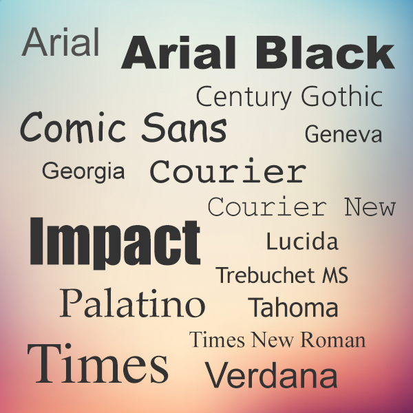
Until recently, the list of web-safe fonts was limited to about 16 typefaces, including these classics:
- Arial
- Arial Black
- Century Gothic
- Comic Sans
- Courier
- Courier New
- Geneva
- Georgia
- Impact
- Lucida
- Palatino
- Tahoma
- Trebuchet MS
- Times
- Times New Roman
- Verdana
Web Fonts
Unlike web safe fonts, web fonts are not pre-installed on the user’s system. The fonts are downloaded by the user’s browser while rendering the webpage, and then applied to your text. When you have found/bought the font you wish to use, just include the font file on your web server, and it will be automatically downloaded to the user when needed. The main drawbacks of using web fonts is it will slow your site’s load time.
Here are different font formats:
TrueType Fonts (TTF)
TrueType is a font standard developed in the late 1980s, by Apple and Microsoft. TrueType is the most common font format for both the Mac OS and Microsoft Windows operating systems.
OpenType Fonts (OTF)
OpenType is a format for scalable computer fonts. It was built on TrueType, and is a registered trademark of Microsoft. OpenType fonts are used commonly today on the major computer platforms.
The Web Open Font Format (WOFF)
WOFF is a font format for use in web pages. It was developed in 2009, and is now a W3C Recommendation. WOFF is essentially OpenType or TrueType with compression and additional metadata. The goal is to support font distribution from a server to a client over a network with bandwidth constraints.
The Web Open Font Format (WOFF 2.0)
TrueType/OpenType font that provides better compression than WOFF 1.0.
SVG Fonts/Shapes
SVG fonts allow SVG to be used as glyphs when displaying text. The SVG 1.1 specification define a font module that allows the creation of fonts within an SVG document. You can also apply CSS to SVG documents, and the @font-face rule can be applied to text in SVG documents.
Embedded OpenType Fonts (EOT)
EOT fonts are a compact form of OpenType fonts designed by Microsoft for use as embedded fonts on web pages.
Browser Support for Font Formats
The numbers in the table specifies the first browser version that fully supports the font format.
| FONT FORMAT |  |  |  |  |  |
|---|---|---|---|---|---|
| TTF/OTF | 9.0* | 4.0 | 3.5 | 3.1 | 10.0 |
| WOFF | 9.0 | 5.0 | 3.6 | 5.1 | 11.1 |
| WOFF2 | Not supported | 36.0 | 35.0* | Not supported | 26.0 |
| SVG | Not supported | 4.0 | Not supported | 3.2 | 9.0 |
| EOT | 6.0 | Not supported | Not supported | Not supported | Not supported |